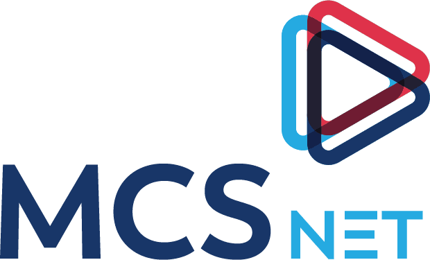
MCSnet undertook a complete rebranding process in 2019. The new logo has a story behind it and we are happy to present it here.
Connecting Communities
The three triangles are coming together to represent community and gathering (bringing communities and families closer together).
Life > Tech Specs
The “play” symbol in the icon is used to highlight the fact that the company offers more than just towers and a signal, but rather experiences and life with no boundaries.

Trust
The colours were chosed to be similar to the former logo’s colours. Blues also represent trust and reliability, while red brings energy and life.
Reliable
The lines make an infinite loop to help illustrate MCSnet’s commitment to continuous uptime as well as showcasing the idea of infinite possibilities.
Honest and Strong
There is a strong emphasis on MCS with the front being bold and sturdy. The strong geometric letter forms give the logo a reliable and honest feel. The font was also chosen to ensure readability. NET is in all caps and has been simplified/deconstructed so that it’s not read as a URL.
Tower
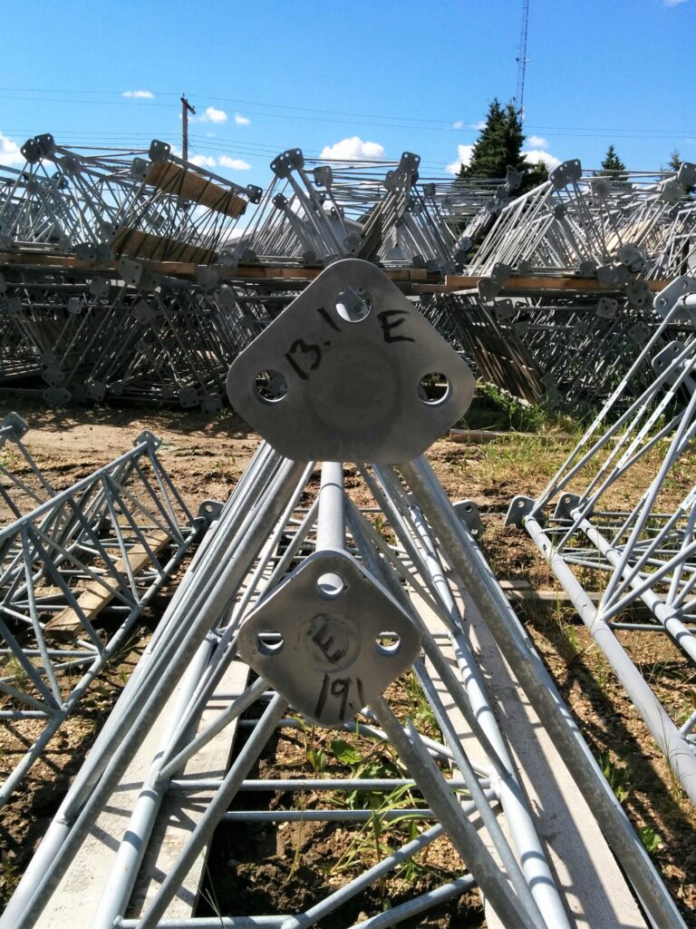
The triangle shape represents the overhead view of a tower when looking down at it from the top.
Innovation
The right arrow direction and placement of the icon helps reinforce MCSnet’s commitment to innovation and thinking of the future.
Internet Signal
The triangle also make a centre triangle, which makes it feel like there are concentric lines emitting out, similart to the Wi-Fi signal. These lines are used to give it an airy and wave-like feel.

